top of page

Alaska Airlines Rebranding
MY FOUNDATION
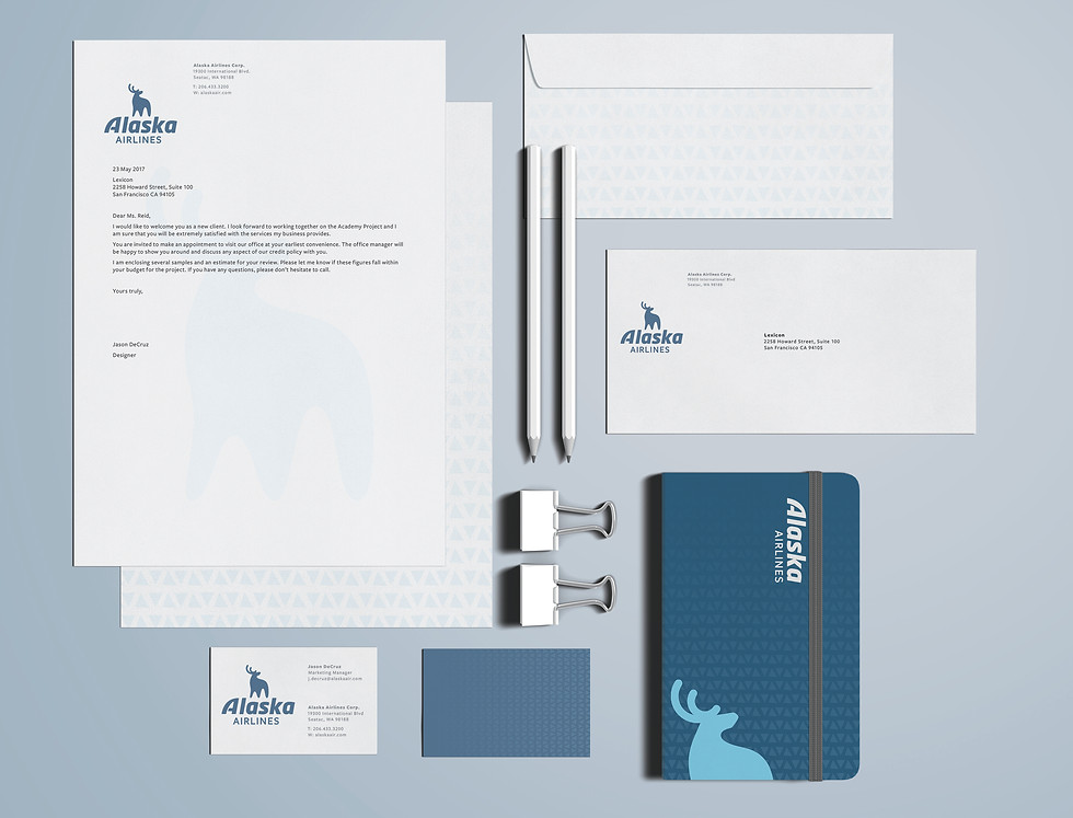
Alaska Airlines started as a tiny airport in the state way back in 1932 as McGee Airways. The brand then began to bring in the state’s feel and history and renamed itself accordingly. Since then, they have modernized their identity over and over to keep up with current trends. Though the company’s current branding direction is very exciting and attractive, I thought it to be a good experiment to put the fauna and landscape of the state of Alaska into the Alaska Airlines brand. My goal was to give the brand a revived, adventurous feel that we get travelers excited.
MY PATH
This brand evolution aimed to play up that Alaska has a vibrant visual history. I researched how the state expressed itself both in the past and currently though its advertising and monuments. The large slab-serifs and tribal pattern elicit this natural feel for which the state is known. The colors were taken directly from the landscapes of Alaska itself. The symbol, an Alaskan deer, called a ‘Sitka,’ was chosen as the bold symbol of courage as it looks up at the planes it’s overseeing and protecting. It embodies the pride and adventure I want their new and old travelers to feel.


 |  |  |
|---|---|---|
 |  |  |
 |  |
bottom of page